Estimote
branding, art direction, logo, product, packaging, web, illustrations, icons.
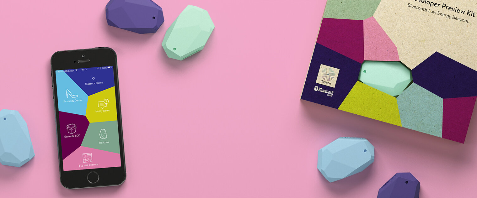
In 2013 Estimote founders invited me to create a product design and visual identity. Together with a team, we created designs for beacons, packaging, apps, and web designs. I was responsible for creating a brand, visual and functional identity from scratch, ensuring that the process is smooth and effect consistent. I’ve designed the logo, packaging, print materials, illustrations, animations, and icons design. I also created the brand guidelines for internal use as well as for partners. I produced photo sessions, promo videos, and tutorials. I also worked on the interior design of the office space and mentored junior designers. In 2014 we won Łódz Design Festival “Must Have” award for designing beacons. Collaboration: Olga Dąbrowska
Shapes used in Estimote’s visual identification, from the logo to the products, are based on the Voronoi Diagram, which mimics organic cells. The diagram comes in 2D and 3D versions. It is a way to partition a plane based on the distance between points, similarly to how we imagine beacons partitioning the physical world into digital regions.
Estimote logo represents the essence of Estimote brand. It follows strict mathematical principles of Voronoi diagram, but at the same time it can expand to infinity and be rearranged in countless variants. The logo does not appear on all Estimote products. For example, you won’t find it on beacons and stickers. That’s because the logo is just one way to represent Estimote brand. With the Voronoi diagram we can make other elements of our ID do it just as well.


